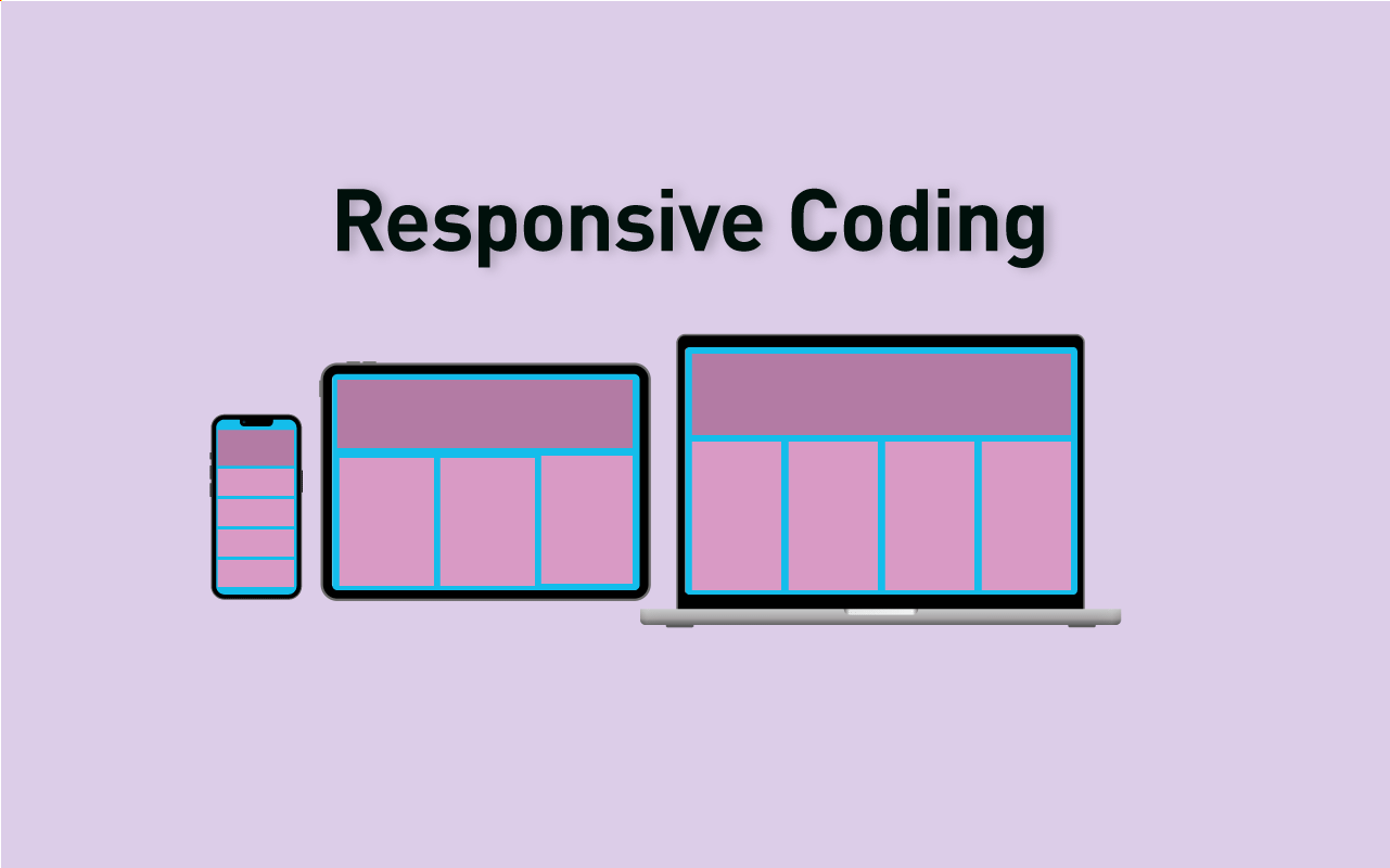
レスポンシブなウェブサイトで様々な画面サイズやデバイスに対応するためには、コーディングに工夫が必要です。
画面サイズに応じて最適化することでユーザーにとって見やすく、使いやすいサイトを作りあげることができます。
本記事では画像や動画、テキストなどのコンテンツが、画面サイズに応じて適切に表示されるようにするためのコツをとりあげています。
画像のレスポンシブ対応、画面サイズに応じた画像を表示する
レスポンシブサイトで画面サイズに応じて適切な画像を表示することは、ウェブサイトの表示速度やパフォーマンスにおいて重要な要素です。
スマホで画像がはみ出してしまうのを防ぐ
スマホなど小さい画面で、画像がはみ出してしまうのを防ぐにはimg要素に以下のようなCSSを適用すると、サイズに応じて画像を縮小させることができます。
img{
     max-width:100%;
     height:auto;
}max-width:100%は、要素の幅の最大値を親要素の幅に設定するプロパティです。画像が原寸大で表示されて、親要素からはみ出てしまうことを防ぐことができます。
- 画像が親要素の幅よりも大きい場合、画像は自動的に縮小されて表示されます。
- 画像が親要素の幅よりも小さい場合、画像はそのままの大きさで表示されます。
- 画像の高さも自動的に調整するためには、height:autoを指定します。
画像をレスポンシブデザインに対応するsrcset属性、picture要素
画像を縮小するには、上記のようにmax-width:100%を設定すれば対応できます。
でもこれだけでは画像の品質が低下したり、レスポンシブデザインに対応できない場合があります。そこで、srcset属性やpicture要素で使い分ける方法を紹介します。
srcset属性とは
srcset属性は、画像のソースを複数指定できるものです。
img要素にsrcset属性を付与することで、同じ画像の異なるサイズや解像度のバージョンを指定することができます。
ブラウザはデバイスの画面サイズやピクセル密度に応じて、最適な画像を選択して表示します。srcset属性は主に同じアスペクト比の画像を切り替える場合に使います。
<img srcset="image-300.jpg 300w, image-600.jpg 600w" src="image.jpg">ブラウザは画面の幅やピクセル密度に応じて最適な画像を選択して表示します。
picture要素とは
picture要素を使うと、srcset属性よりもさらに柔軟に画像を切り替えることができます。
picture要素は異なるアスペクト比やフォーマットの画像を指定することができます。
picture要素の中には、source要素とimg要素が入ります。source要素にmedia属性やtype属性を付して条件を指定します。
img要素には画像の代替テキストやフォールバック画像を指定します。
以下のように指定することで、ブラウザは条件に合致する最初の画像を選択して表示します。picture要素は、主に異なるアスペクト比やフォーマットの画像を切り替える場合に使います。
<picture>
  <source media="(max-width: 600px)" srcset="small.jpg">
  <source media="(max-width: 1200px)" srcset="medium.jpg">
  <img src="large.jpg" alt="Example image">
</picture>
ブラウザはメディアクエリに応じて画像を切り替えます。これにより、レイアウトやコンテンツに合わせた画像を表示できます。
Retinaディスプレイ対応の画像を用意する場合
srcset属性でブラウザは使用するべき画像の解像度を選択できます。
例えば以下のように、PCではimage.jpg、Retinaディスプレイのスマートフォンでは[email protected]、高解像度ディスプレイのスマートフォンでは[email protected]を用意して、適切な画像をブラウザが選択することができます。
<img src="image.jpg"
srcset="[email protected] 2x,
[email protected] 3x"
alt="Responsive image">またpicture要素を使うと、複数の画像を一つの要素内で管理することができます。これによってブレイクポイントに応じて画像を切り替えることができます。
<picture>
  <source media="(min-width: 768px)" srcset="[email protected] 2x, [email protected] 3x">
  <source media="(min-width: 576px)" srcset="[email protected] 1.5x, [email protected] 2x">
  <img src="image.jpg" alt="Responsive image">
</picture>
この例では、PC用に大きな画像、スマートフォン用に小さな画像を用意し、picture要素内にブレイクポイントに応じたsource要素を設定し、適切な画像を表示します。
最後に非対応のブラウザ向けにimg要素を追加し、適切な画像を表示します。
srcset属性は同じ画像を異なる解像度で提供する場合に使用します。
例えば、<img>要素にsrcset属性を追加して、1x、2x、3xの3つの解像度の画像を提供することができます。ブラウザーは、デバイスの解像度に応じて適切な画像を選択します。
一方、<picture>要素はスマートフォンとデスクトップで異なる画像を表示したい場合に使用することができます。
<picture>要素には、複数の<source>要素が含まれ、それぞれに画像のソースと条件が指定されています。ブラウザーは、条件に一致する最初の画像を選択しそれを<img>要素に表示します。
画面解像度で背景画像を振り分ける(Retinaディスプレイ対応)
Retinaディスプレイでも綺麗に背景画像を表示できるように、解像度によって背景画像を出し分けます。
image-setでRetina用画像を出し分ける
Image-set関数で解像度比率に応じて自動的に最適な画像を選択して表示します。
.hoge {
background-image: url(../img/hoge.png);
background-image: image-set(url(../img/hoge.png) 1x, url(../img/[email protected]) 2x);
background-image: -webkit-image-set(url(../img/hoge.png) 1x, url(../img/[email protected]) 2x);
}- 使用する画像を縦横2倍で作成します。例えば、ブラウザ上で幅200pxで表示したい画像があれば、幅が400pxの画像を用意します。
background-imageプロパティにimage-set関数を使います。image-set関数では、1xにデバイスピクセル比が1の場合に表示したい画像、2xにデバイスピクセル比が2の場合に表示したい画像を指定します。- フォールバックとして通常のbackground-imageも指定します。これはimage-setよりも前に記述する必要があります。
- さらにChromeやEdge用に-webkit-image-set関数も指定します。
media queryで切り分ける
Media Queryでもデバイスの画面解像度などの条件にも応じたスタイルの適用が可能です。
参考サイト CSS TRICKS Retina Display Media Query
@media only screen and (min-device-width : 320px)
  and (max-device-width : 480px) {

  /* ブラウザの表示環境が幅が320px以上で、480px以下の場合に適用 */

  @media
    only screen and (-webkit-min-device-pixel-ratio: 2),
    only screen and (   min--moz-device-pixel-ratio: 2),
    only screen and (     -o-min-device-pixel-ratio: 2/1),
    only screen and (        min-device-pixel-ratio: 2),
    only screen and (                min-resolution: 192dpi),
    only screen and (                min-resolution: 2dppx) {

  /* Safari,GoogleChrome、Firefox、Operaなどのブラウザにおいて、Retinaディスプレイに対応する
          さらに画像のdpi値やdppx値を指定 */

  }

}
device pixel ratio(デバイスピクセル比)とは、1ピクセルの画像データをディスプレイが何ピクセルで表現するかを表す数値です。
デバイスピクセル比は、画面の解像度や密度によって異なります。例えば、iPhone 12 Proはデバイスピクセル比が3で、CSSピクセル1つに対してデバイスピクセル3つが使われています。
Sassのmixinを使ってコーディング効率をアップできます。>> レスポンシブな背景画像を表示するmixin
効率的にコーディングできる便利なmixin集はこちらでまとめています>> SCSS mixinの使い方とレスポンシブサイトで使えるおすすめ実例集
videoコンテンツをレスポンシブ対応する
<div class="video-wrapper">
  <video src="sample.mp4" controls></video>
</div>videoタグにmax-width: 100%;を指定して、親要素の幅に応じてvideoタグの幅を自動的に調整します。また、height: auto;を指定して、幅に合わせて高さを自動的に計算します。
.video-wrapper {
  position: relative;
  padding-bottom: 56.25%; /* 16:9アスペクト比 */
  height: 0;
  overflow: hidden;
}

.video-wrapper video {
  position: absolute;
  top: 0;
  left: 0;
  width: 100%;
  height: 100%;
  max-width: 100%;
  height: auto;
}video-wrapperクラスにはposition: relative;とpadding-bottom: 56.25%;が指定します。これは、16:9のアスペクト比を維持しながら、親要素の幅に応じてvideoタグの高さを計算するために必要です。
videoタグにはposition: absolute;とwidth: 100%;、height: 100%;を指定しています。これは、videoタグをvideo-wrapper要素に対して絶対位置で配置し、幅と高さを100%にして、親要素に合わせて調整するためのものです。
これでvideoタグが自動的に調整され、レスポンシブな動画の実装が可能になります。
テキストの改行位置の調整
モバイルでは画面が小さいのでテキストの表示も気をつける必要があります。PCで改行した位置がモバイルで見ると不自然な場合などがあります。
スマホモバイル画面ではテキストを省略する場合
@media screen and (max-width: 767px) {
  .text {
    white-space: nowrap;
    overflow: hidden;
    text-overflow: ellipsis;
  }
}
スマホ画面幅が767px以下の場合に、.textクラスのテキストを一行に抑え、テキストがはみ出した場合には省略記号で表示するようにしています。
text-overflow: ellipsis;は、テキストが親要素の幅を超えた場合に、末尾を省略符号(…)で表示するCSSプロパティです。
これにより、長いテキストをコンパクトに表示することができます。ただし、このプロパティを使用するためには、親要素にはwidthプロパティやmax-widthプロパティなど、幅を指定する必要があります。
また、テキストがすべて表示されている場合は省略符号は表示されません。このプロパティは主に、タイトルやキャプションなどの短いテキストの表示に使用されます。
スマホでは改行したくない、PCでは指定位置で改行したい場合
改行を完全に制御したい場合には、以下のように<br>タグを使ったCSSを記述することもできます。
スマホでbrタグを非表示にするには、メディアクエリを使って画面幅が768px以下の場合に.hide-for-spクラスを適用します。以下はサンプルコードです。
@media screen and (max-width: 768px) {
  .hide-for-sp {
    display: none !important;
  }
}
!importantを指定して、スタイルが上書きされないようにしています。
下記の文章は768以下では改行されません。
この文章はダミーです。
文字の大きさ、量、字間、行間等を確認するために入れています。
<p>この文章はダミーです。<br class="hide-for-sp">
文字の大きさ、量、字間、行間等を確認するために入れています。</p>
画面サイズによって要素を表示or非表示にする
brタグに限らず、画面サイズや解像度によって要素を表示させたり、非表示にさせたりしたい時があります。そのような時に表示非表示できるクラスを用意をしておくと便利です。
多用するとウェブサイトのレスポンスやSEO的に不利になる場合があるので注意が必要です。
画面サイズに応じて表示する
この文章はダミーです。
文字の大きさ、量、字間、行間等を確認するために入れています。